

Completed
MIK! — Mag Ipon Ka!
Personal Budget Tracker
Case study — a brutalist finance dashboard built with Laravel, Vue 3, and kinetic typography
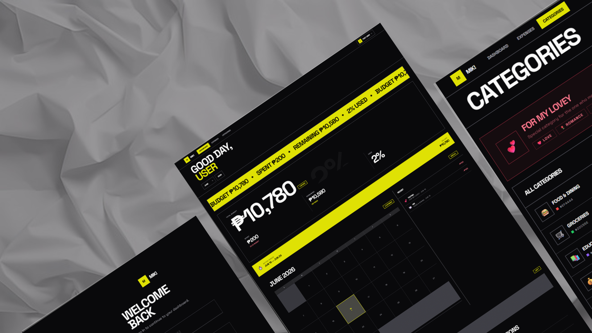
This case study covers the design philosophy, technical architecture, and feature breakdown of the Personal Budget Tracker — a project built in a single session with Xiaomi MiMo Code assistance.
Designed and built in a single session.
View on GitHub ↗01 — Overview
The short version
A brutalist finance dashboard built with Laravel, Vue 3, and kinetic typography. Instead of following the sea of dark-mode SaaS dashboards, this project uses typography as the interface — massive scale, constant motion, hard color inversions, and brutalist geometry.
- Role
- Full-stack developer & UI/UX designer
- Stack
- Laravel · Vue 3 · Inertia.js · Tailwind CSS
- Timeline
- Single session (design + implementation)
- Type
- Web application — case study
- AI assistance
- Xiaomi MiMo Code
- Status
- Live on GitHub
02 — Problem
Why rebuild it at all
Bloated or basic
Personal finance tracking tools are either bloated with features nobody uses, or so basic they're abandoned after a week.
The core need
See your financial health at a glance, track spending patterns, and stay within budget — without the cognitive overhead of enterprise accounting software.
The goal
Build a budget tracker that feels alive — something you want to open every day because the interface itself is engaging.
03 — Philosophy
Typography is the interface
Instead of following the sea of dark-mode SaaS dashboards, this project uses kinetic typography — a brutalist design system where typography is the interface.
Typography as structure
Headlines at 6–10rem, numbers at 8–12rem. Text fills the screen and becomes the primary visual element.
Constant motion
Infinite marquees scroll financial stats. Nothing is ever still.
Hard color inversions
Cards flood to acid yellow on hover, text inverts to black. No gentle fades — instant, dramatic shifts.
Brutalist geometry
0px border radius, 2px solid borders, completely flat design. No shadows, no gradients.
Generic dark mode with subtle gradients had become invisible — every finance app looks the same. Kinetic typography creates an instantly recognizable identity through aggressive scale, relentless motion, and high-contrast color.
04 — Design system
Six colors, one accent
Background
#09090B
Foreground
#FAFAFA
Muted
#27272A
Muted FG
#A1A1AA
Accent
#DFE104
Border
#3F3F46
The single accent color (acid yellow) is used sparingly but boldly — navigation highlights, hover states, the stats marquee, and the salary history cards.
Type scale
- Page headingsclamp(2rem, 6vw, 5rem)
- Hero numbersclamp(3rem, 12vw, 10rem)
- Background numbersclamp(8rem, 20vw, 16rem)
- Section titlestext-3xl uppercase, tight tracking
- Body texttext-lg — larger than typical web
- Labelstext-xs uppercase, tracking-widest
Typography
Space Grotesk — strong geometric shapes, excellent at large sizes.
Shape language
Border radius: 0px everywhere · Borders: 2px solid #3F3F46 · Shadows: none — depth through color layering only · Grid dividers: gap-px with border-colored backgrounds create connected card systems
Architecture
Laravel
Backend · Auth · DB
Inertia.js
Bridge · SPA-like nav
Vue 3
Components · Reactivity
Tailwind CSS
Design tokens · Styling
Every component uses these tokens — no hardcoded colors. Changing the accent color globally requires a single token change.
05 — Features
What makes it feel alive
Stats marquee
A yellow banner that scrolls budget, spent, remaining, and percentage at fast speed. Traditional stat cards are static and forgettable — a marquee creates urgency and energy.
Massive hero number
The total budget is displayed at viewport-responsive scale (clamp(3rem, 12vw, 10rem)). In kinetic typography, scale = importance.
Calendar with heatmap
Days with expenses show intensity through background color. The selected day inverts to the accent color with a dramatic scale transform.
Hard color inversion cards
Every card floods to acid yellow on hover. All text simultaneously inverts to black. The signature interaction — instant, dramatic, memorable.
Connected card grids
Using gap-px with a border-colored parent container, cards appear as one connected system with hairline dividers — like a circuit board.
Oversized form inputs
All inputs use bottom-border only, oversized text (text-2xl font-bold), and uppercase placeholder text. Forms become part of the design language.
Component vocabulary
06 — Motion
Every animation has a job
All animations respect prefers-reduced-motion — marquees pause, entrance animations skip.
07 — Accessibility
Bold, not hostile
Contrast
Off-white on rich black = ~15:1 ratio (WCAG AAA)
Focus indicators
Acid yellow 2px outline on all interactive elements
Keyboard navigation
All buttons, links, and calendar days are focusable
Touch targets
Minimum 44px for all interactive elements
Screen reader
ARIA labels on calendar days, form fields, and icon buttons
08 — Evolution
Four versions, one direction
Functional foundation
v1Standard CRUD interface with basic styling. Worked, but visually invisible.
Dark mode toggle
v2Added dark/light mode switching with cyan accent. More modern, but still generic.
Dark-only with cyan
v3Removed the toggle, committed to dark mode. Cleaner, but the design still blended in with every other finance app.
Kinetic typography
v4 — FinalComplete visual overhaul. Acid yellow instead of cyan. Sharp corners instead of rounded. Massive type instead of standard sizes. Marquees instead of static cards. Connected grids instead of individual cards.
Each iteration was a deliberate rejection of what came before — pushing toward a more distinctive, memorable identity.
09 — Results
What shipped
Full CRUD
Expenses, salary entries, categories — all functional
Responsive
Works from 320px mobile to 1440px+ desktop
Performant
Lazy-loaded routes, animated counters, skeleton loaders
Accessible
WCAG AA contrast, keyboard navigation, screen reader support
Memorable
Instantly recognizable design that stands apart from generic dashboards
10 — Reflections
What I would keep, what comes next
What worked
- Kinetic typography creates instant identity — the design is unmistakably this project
- Single accent color forces disciplined use — every yellow element feels intentional
- Connected grids (gap-px) solve the "card soup" problem — the layout feels architectural
What comes next
- Add real-time charts (Chart.js or D3) for spending trends
- Implement push notifications for budget limit warnings
- Add export to CSV/PDF for tax reporting
- Build a PWA for mobile home screen install
- Support multi-currency for international users
The most important design decision wasn't a color or a font — it was choosing to be bold. Generic designs are forgettable. A strong design system, applied consistently, creates something people remember and want to use.
Built with intention. Designed to be remembered.
11 — Links
Go look at it
© 2026 Liam Flores — Personal Budget Tracker Case Study